The LC flag is a modular logo mark created from a 7x5 grid and the text was offset so that the double L’s act as a flagpole, reemphasizing the flag concept.
THEIR STORY
Born out of a small downtown festival in 1991 by founder Pearl Fu as a way to highlight four countries - Kenya, Russia, South Korea, and China- Local Colors has established itself as a nonprofit organization that celebrates the ethnic diversity of all 56 represented countries throughout Roanoke, Virginia. The organization’s mission is to celebrate ethnic diversity by visiting elementary schools, hosting annual workshops, and their Local Colors Festival.

Original Local Colors logo designed in 1992.

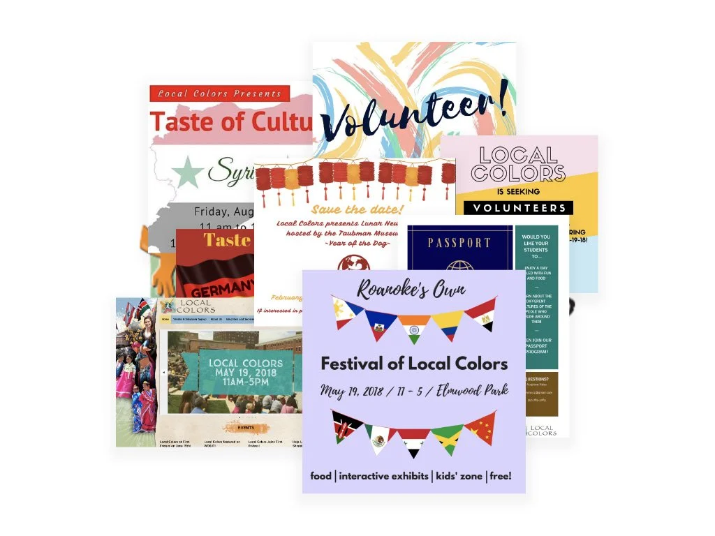
Collection of old inconsistent promotional flyers.
THE CHALLENGE
Today, Local Colors is led by a director and supported by a steering committee comprised of passionate volunteers, and over the years, many of those volunteers have played a role in helping the organization grow. Over the past ten years, however, the inconsistent branded items and lack of marketing resulted in a steady decline in attendance at many hosted events that resulted in the loss of government funding due to Local Color’s inability to meet participation numbers.
THE SOLUTION
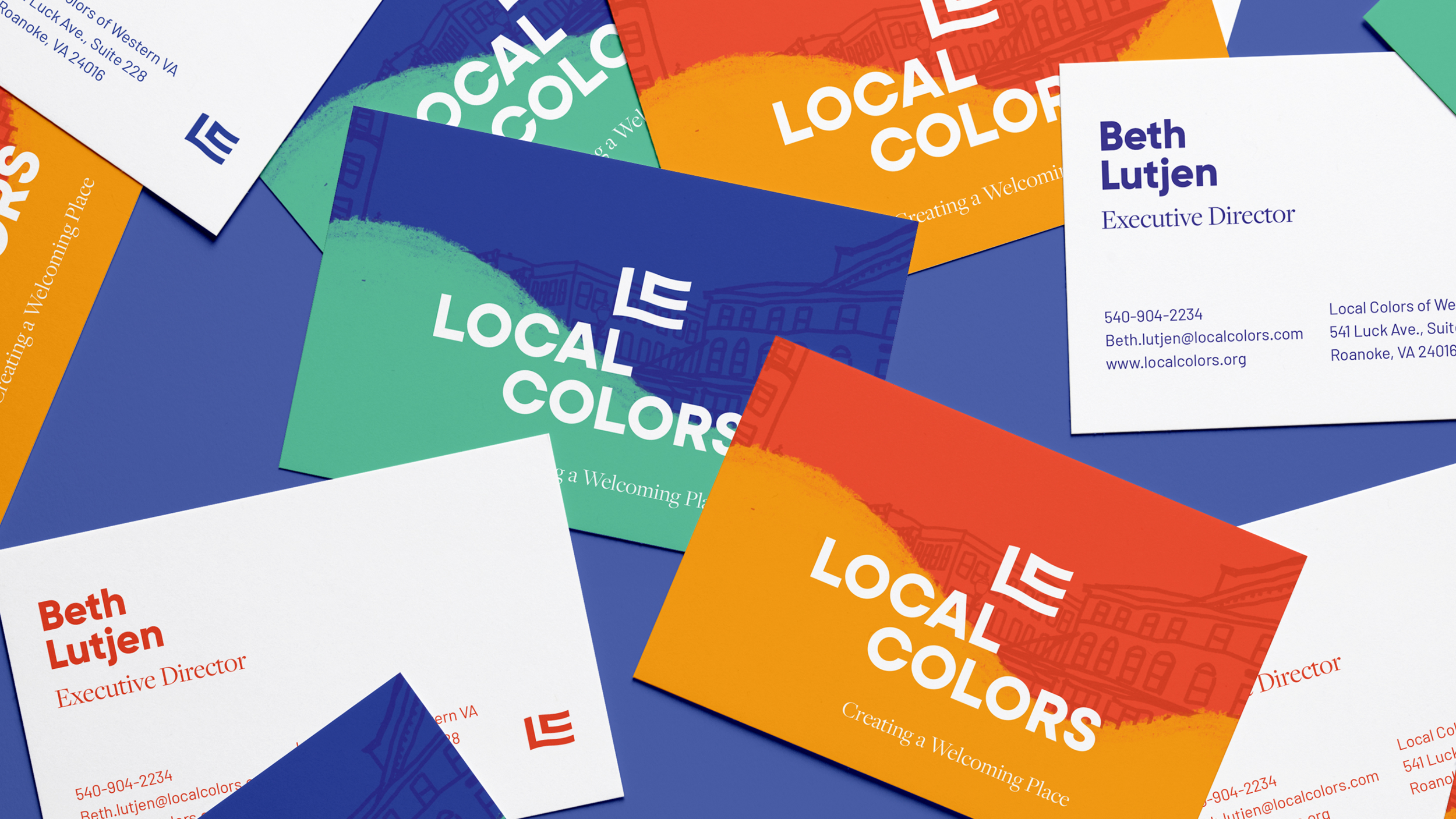
I partnered with Local Colors in 2018 and led a small team of student designers to rebrand the organization’s logo and promotional materials. The logo was created by a 7x5 grid that makes “LC” for the primary mark, but also creates a logo system that can create any of the 56 represent country’s flags that can replace the LC flag for country-specific holidays and events. The rest of the branding utilizes bright, vivid colors and original illustrations that highlight fun moments from the Local Colors Festival.
The LC flag logomark was made from a 7x5 grid, which can be used to create any of the 56 celebrated countries’ flags. The LC logomark can be replaced with the countries flag for specific holidays and events (i.e. Chinese New Year).
Bright colors and illustrations were added to promote the monthly festivals.


Local Colors
of Southwest Virginia.
Client:
Local Colors of Southwest Virginia | Roanoke, VA.
Creative Team:
Patrick Finley, Art Director and Designer
Julia Card, Color
Mason Peterson, Wordmark
Kehong Lu, Illustrations
Media:
Logo, Website Design & Development, Illustrations, Poster, and Banner
Year & Duration:
2018 - Present | Various projects were created over a three-year window
Impact:
Since the launch of the rebrand in 2019, the Local Colors Festival saw its attendance increase by 330% in the first year.
Although the Local Colors redesign was a local project, it has received over a dozen national and international design awards, including top awards at the United Design Alliance and Indigo Awards.
Awards & Accolades:
2021 United Design Alliance SSL Gold Award
2021 Graphic Design USA 58th Annual Graphic Design Award (website)
2021 Graphic Design USA 21st Annual Web Design Award Web Design Award
2021 Graphis Design Annual Honorable Mention
2020 Indigo Awards Silver Award in Design for Change
2020 American Advertising Federation Roanoke Chapter’s Best-in-Print
2020 American Advertising Federation Roanoke Chapter’s Gold ADDY in Out-of-Home & Ambient Media
2020 American Advertising Federation Roanoke Chapter’s Gold ADDY in Elements of Advertising, Illustration Series
2019 13th Annual IDA Competition Honorable Mention
2019 United Design Alliance Gold Award
2020 American Advertising Federation Roanoke Chapter’s Gold ADDY in Elements of Advertising, Logo Design
2019 Graphic Design USA 56th Annual Graphic Design Award
2019 HOW International Design Awards Merit Award


